"Cadence completely transformed how we build marketing sites. Swapping clients is literally a matter of injecting new tokens and content models—zero component rewriting required."
Design System & Reference
Cadence Living Styleguide
An interactive visual index of every component variant, layout option, and design token available in the theme. Copy the code snippets directly into your page templates.
1. Semantic Color Tokens
Configured in src/styles/tokens.css and optionally overridden in src/theme.config.ts.
3. Badges (Badge.astro)
Used for categories, statuses, order tags, and pills.
Variants:
DefaultPrimarySuccessWarningInfo
Sizes:
Small (sm)Medium (md)
<!-- Usage Example -->
<Badge variant="primary" size="sm">Core Discipline</Badge>
<Badge variant="success" size="sm">Active</Badge>
4. Icons (Icon.astro)
Accessible, zero-JS SVGs with typed names and consistent sizing.
Available Icons:
arrow-rightcheckmenuclosestarshieldsparklesphonemailchevron-downexternal-linkawardclockzaplocksunmoonlaptop<!-- Usage Example -->
<Icon name="star" size="md" />
<Icon name="arrow-right" size="sm" />5. Card Elevations (Card.astro)
The fundamental surface primitive used across all sections.
variant="bordered"
Bordered Card
Subtle 1px border with elevated surface background. Default for most theme sections.
variant="elevated"
Elevated Card
Features subtle ambient drop shadow (--shadow-md) for prominent callouts.
variant="default"
Default Flat Card
Flat surface container without outer border or shadow.
<!-- Usage Example -->
<Card variant="bordered" padding="lg">
  <h3>Card Content</h3>
  <p>Inside text...</p>
</Card>
6. Theme Switcher (ThemeSwitcher.astro)
Accessible 3-option segmented control offering Light, System, and Dark themes with zero-flash persistence and real-time OS preference adherence.
Compact Icon-Only (Default in Site Header):
With Text Labels:
<!-- Usage Examples -->
<!-- Compact Icon-Only (Header) -->
<ThemeSwitcher size="sm" />

<!-- Larger with Text Labels -->
<ThemeSwitcher size="md" showLabels={true} />
7. Hero Variants (Hero.astro)
Available via variant="centered" | "split" | "minimal" | "cover".
Option 1: variant="centered" (Homepage Default)
Centered Layout
Impactful Centered Value Proposition
Ideal for primary landing pages that want a focused message with primary and secondary call-to-actions.
<Hero
  variant="centered"
  eyebrow="Core Hook"
  title="Your Headline Here"
  description="Your description..."
  primaryCta={{ label: 'Get Started', href: '#contact' }}
  secondaryCta={{ label: 'Learn More', href: '#features' }}
/>
Option 2: variant="split" (Product Showcase with Framed Image)
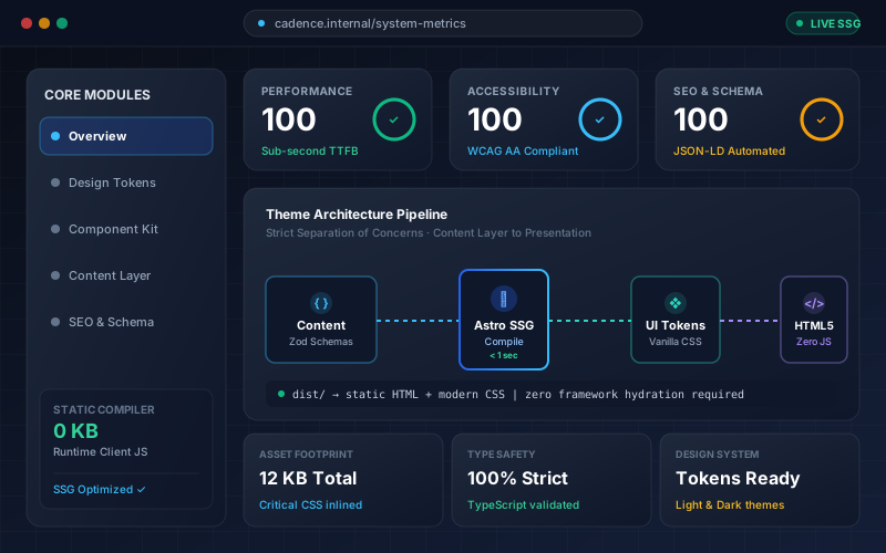
Verified Authority • System Ready
Side-by-Side Hook with Visual Showcase
Top-rated architecture engineered for high performance, zero client JS overhead, and automated type safety across modern devices.
- Zero Runtime Hydration – Pure static HTML delivery
- 100/100 Core Web Vitals Guaranteed
- Pre-configured Schema.org JSON-LD and SEO tags
<Hero
  variant="split"
  eyebrow="Verified Authority • System Ready"
  title="Side-by-Side Hook with <span class='text-accent'>Visual Showcase</span>"
  description="Top-rated architecture engineered for high performance..."
  highlights={[
    'Zero Runtime Hydration – Pure static HTML delivery',
    '100/100 Core Web Vitals Guaranteed',
    'Pre-configured Schema.org JSON-LD and SEO tags',
  ]}
  image={{
    src: '/images/hero-showcase.svg',
    alt: 'Application preview',
  }}
  primaryCta={{ label: 'Try Cadence', href: '#contact' }}
  secondaryCta={{ label: 'View Demo', href: '#features' }}
/>
Option 3: variant="minimal" (Subpages / Clean)
Minimal Header
Concise Page Header for Content Pages
Streamlined header used for /services, /about, and documentation pages.
<Hero
  variant="minimal"
  eyebrow="Category"
  title="Services & Capabilities"
  description="Streamlined description for subpages..."
  primaryCta={{ label: 'Consult Our Team', href: '#contact' }}
/>
Option 4: variant="cover" (Full Cover Image with Text Overlay)

Immersive Cover Layout
Full-Bleed Atmospheric Background Hook
High-contrast overlay engineered for cinematic landing pages, product announcements, and brand introductions.
<Hero
  variant="cover"
  eyebrow="Cinematic Launch"
  title="Full-Bleed Visual Value Proposition"
  description="High-contrast typography with automated overlay ensuring WCAG AA readability..."
  image={{
    src: '/images/hero-cover.svg',
    alt: 'Cover backdrop',
  }}
  primaryCta={{ label: 'Get Started', href: '#contact' }}
  secondaryCta={{ label: 'Explore Features', href: '#features' }}
/>
8. Features & Card Display Variants (Features.astro)
Available via variant="grid" or variant="cards-with-image".
Option 1: variant="grid" (Icon Card Grid)
Core Pillars
Built on Sound Architectural Principles
Best for high-level core pillars, guarantees, and tech stack highlights.
Static-First Performance
Zero-JS by default. Compiles purely to semantic HTML and modern CSS at build time for near-instant rendering and perfect Core Web Vitals.
WCAG AA Accessibility
Built-in skip links, landmark semantics, focus visible rings, accessible labels, and full keyboard operability across every component.
Comprehensive SEO & JSON-LD
Automated canonical URL resolution, Open Graph tags, and Schema.org @graph generation keeping machine data and page text in sync.
Semantic Design Tokens
Centralized CSS custom properties for colors, spacing, typography, and dark mode support. Re-theme an entire brand in minutes.
<Features
  variant="grid"
  eyebrow="Core Pillars"
  title="Built on Sound Architectural Principles"
  description="Summary paragraph..."
  features={features}
/>
Option 2: variant="cards-with-image" (Banner Graphic Cards + Links)
Media Cards
Visual Solutions with Deep-Links
Best for service teasers, portfolio pieces, or featured workflow highlights.
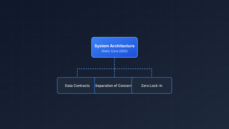
Architecture & System Design
Clean, scalable site foundations engineered with strict separation of concerns, static-first rendering, and zero vendor lock-in.
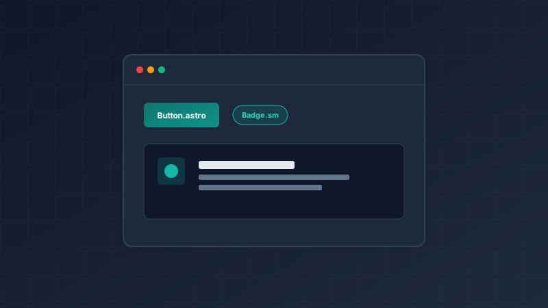
Design Systems & UI Primitives
Accessible, token-driven component libraries built with semantic HTML and CSS custom properties for effortless brand re-theming.
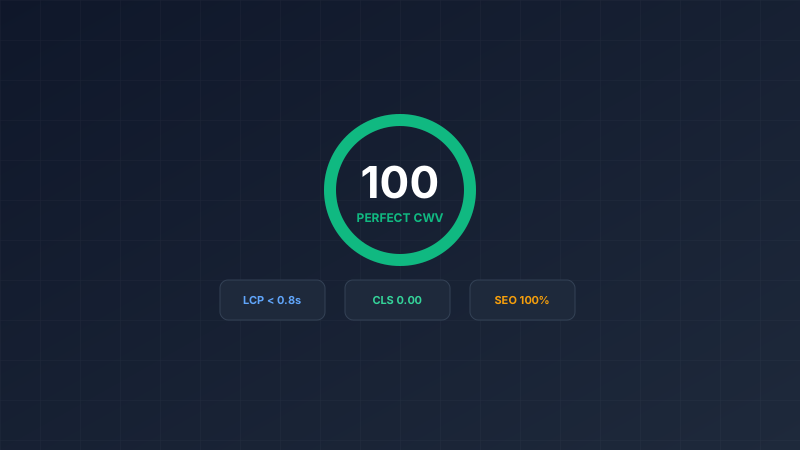
Performance & SEO Optimization
Lightning-fast static page generation, automated JSON-LD schema graphs, perfect Core Web Vitals, and crawlable internal linking.
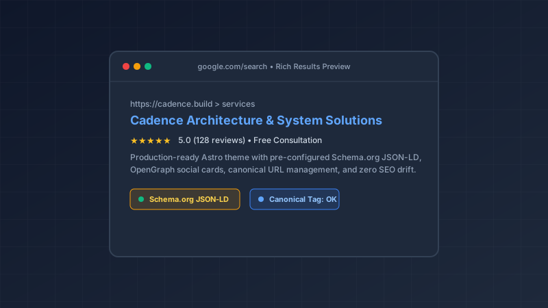
SEO & Structured Data
Automated Schema.org JSON-LD generation, dynamic OpenGraph social cards, canonical URL management, and zero-leak crawl directives.
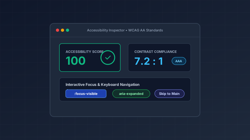
Accessibility & WCAG AA
Production-tested keyboard navigation, high-contrast tokens, screen reader attributes, and semantic landmarks built into every component.
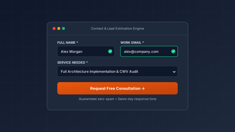
Forms & Lead Capture
Accessible, zero-JS fallback contact forms and quote estimators with client-side validation and native platform form actions.
<Features
  variant="cards-with-image"
  bg="default"
  eyebrow="Featured Solutions"
  title="Specialized Capabilities with Real Impact"
  description="Explore our specialized architectural workflows..."
  features={featuredSolutions}
/>
9. Services Specifications (Services.astro)
Detailed cards with category badge headers, descriptions, and feature checklists (✓).
Deliverables
Granular Capabilities & Feature Checklists
Designed for comprehensive service breakdowns and evaluation matrices.
Core Discipline
Architecture & System Design
Clean, scalable site foundations engineered with strict separation of concerns, static-first rendering, and zero vendor lock-in.
- Hierarchical Governance
- Decoupled Data Contracts
- Astro 7 SSG Optimization
Design System
Design Systems & UI Primitives
Accessible, token-driven component libraries built with semantic HTML and CSS custom properties for effortless brand re-theming.
- Design Token Architecture
- WCAG AA Compliance
- Zero-JS Default Primitives
Performance
Performance & SEO Optimization
Lightning-fast static page generation, automated JSON-LD schema graphs, perfect Core Web Vitals, and crawlable internal linking.
- Sub-Second TTFB
- Schema.org @graph Generation
- Zero Runtime JS Overhead
Search Engine Ready
SEO & Structured Data
Automated Schema.org JSON-LD generation, dynamic OpenGraph social cards, canonical URL management, and zero-leak crawl directives.
- Schema.org JSON-LD Generation
- OpenGraph Social Card Automation
- Zero-Drift Canonical URL Rules
Inclusive UX
Accessibility & WCAG AA
Production-tested keyboard navigation, high-contrast tokens, screen reader attributes, and semantic landmarks built into every component.
- 100% Keyboard Navigable
- WCAG AA Contrast Verified (7:1 Ratio)
- ARIA Landmarks & Visible Focus Rings
High Conversion
Forms & Lead Capture
Accessible, zero-JS fallback contact forms and quote estimators with client-side validation and native platform form actions.
- Zero-JS Native Progressive Enhancement
- Real-time Validation & Feedback
- Anti-Spam & Accessible Field Controls
<Services
  variant="default"
  eyebrow="All Capabilities"
  title="Comprehensive Disciplines"
  services={services}
/>
10. Trust Bar (TrustBar.astro)
A high-conversion credibility strip supporting 3 to 4 icons and descriptions. Includes bar (unified borderless strip), cards (borderless floating cards), and minimal (clean flush layout) variants with dynamic alternating background support.
Option 1: variant="bar" (Unified Horizontal Strip — 4 Items)
<TrustBar
  variant="bar"
  items={[
    { icon: 'shield', title: '100% WCAG AA', description: 'Verified accessible contrast & keyboard flow.' },
    { icon: 'zap', title: 'Sub-Second SSG', description: 'Zero runtime JS with 100/100 Core Web Vitals.' },
    { icon: 'award', title: 'Zero Vendor Lock-In', description: 'Pure Astro architecture with typed contracts.' },
    { icon: 'star', title: 'Automated Schema', description: 'Built-in Schema.org JSON-LD & social graph tags.' }
  ]}
/>
Option 2: variant="cards" (Individual Trust Cards — 3 Items for Local Services)
Trust & Quality Standards
Licensed & Insured
VerifiedFully certified technicians with $2M liability coverage.
24/7 Rapid Response
GuaranteedGuaranteed 60-minute emergency arrival window.
Lifetime Workmanship
100%Industry-leading 100% satisfaction and warranty guarantee.
<TrustBar
  variant="cards"
  items={[
    { icon: 'shield', title: 'Licensed & Insured', description: 'Fully certified technicians with $2M liability coverage.', badge: 'Verified' },
    { icon: 'clock', title: '24/7 Rapid Response', description: 'Guaranteed 60-minute emergency arrival window.', badge: 'Guaranteed' },
    { icon: 'award', title: 'Lifetime Workmanship', description: 'Industry-leading 100% satisfaction guarantee.', badge: '100%' }
  ]}
/>
Option 3: variant="minimal" (Inline Borderless Strip — 4 Items)
Trust & Quality Standards
100% WCAG AA
Verified accessible contrast, landmarks, and keyboard flow.
Sub-Second SSG
Zero runtime JS overhead with 100/100 Core Web Vitals.
Zero Vendor Lock-In
Pure Astro static architecture with typed data contracts.
Automated Schema
Built-in Schema.org JSON-LD and dynamic social graph tags.
<TrustBar variant="minimal" />11. Testimonials (Testimonials.astro)
Credibility quote cards supporting 3-card multi-client grid (variant="grid-3" or columns=3) and 2-card dual spotlight (variant="grid-2" or columns=2) with calibrated typography and responsive wrapping.
Option 1: variant="grid-3" (3-Card Multi-Client Grid — 3 Columns)
Multi-Client Grid
Trusted Across Modern Engineering Teams
Full-container 3-column layout calibrated for multi-client credibility.
"The strict adherence to static-first architecture and native accessibility standards makes this the cleanest Astro theme baseline I have ever deployed to production."
"Deploying client sites with sub-second SSG and out-of-the-box WCAG AA compliance cut our delivery cycles in half. It is by far our most reliable architectural asset."
<Testimonials
  variant="grid-3"
  eyebrow="Client Endorsements"
  title="Trusted Across Teams"
  description="Read how organizations scale their digital presence with Cadence."
  testimonials={testimonials}
/>
Option 2: variant="grid-2" (2-Card Dual Spotlight — 2 Columns)
Executive Spotlight
Leadership Perspectives
Focused dual-column layout with calibrated larger quote typography for high-impact endorsements.
"Cadence completely transformed how we build marketing sites. Swapping clients is literally a matter of injecting new tokens and content models—zero component rewriting required."
"The strict adherence to static-first architecture and native accessibility standards makes this the cleanest Astro theme baseline I have ever deployed to production."
<Testimonials
  variant="grid-2"
  columns={2}
  eyebrow="Executive Feedback"
  title="Leadership Perspectives"
  testimonials={testimonials.slice(0, 2)}
/>
12. FAQ (FAQ.astro)
Accessible native disclosure accordions with automated Schema.org JSON-LD FAQPage generation.
Got Questions?
Frequently Asked Questions
Understand the architecture, customization capabilities, and deployment workflow.
What does 'static-first architecture' mean for this theme?
All pages, layouts, and components compile to pure HTML and CSS at build time. Client-side JavaScript is introduced only when interactive behavior strictly requires it, ensuring near-instant page loads and stellar Core Web Vitals.
How is accessibility handled across the component catalog?
Accessibility is a core architectural requirement. Every component uses semantic HTML, explicit keyboard focus rings (:focus-visible), visible skip links, logical heading hierarchy, and accessible names for all interactive controls.
How do I re-theme this site for a different client or brand?
You customize the brand colors, typography, and spacing variables in `src/styles/tokens.css`, update the structured data in `src/data/site.ts` and `src/data/navigation.ts`, and provide your content in `src/content/`. The reusable component code does not need to be touched.
<FAQ
  id="faq"
  variant="default"
  eyebrow="Got Questions?"
  title="Frequently Asked Questions"
  description="Understand the architecture, customization capabilities, and deployment workflow."
  faqs={faqs}
/>
13. Call to Action (CTA.astro)
Prominent action banner designed to drive conversions with primary and secondary CTA options.
Ready to Build with Production Quality?
Deploy a clean, accessible, static-first Astro theme designed to support multiple brands with zero code duplication.
<CTA
  variant="default"
  title="Ready to Build with Production Quality?"
  description="Deploy a clean, accessible, static-first Astro theme designed to support multiple brands."
  primaryCta={{ label: 'Get Started Today', href: '#contact' }}
  secondaryCta={{ label: 'Explore Docs', href: 'https://docs.astro.build' }}
/>
14. Contact & Inquiries (Contact.astro)
Accessible contact section combining business details, multi-channel support information, and validated inquiry forms.
Get In Touch
Connect with Our Architecture Team
Have questions about theme setup, customization, or technical architecture? Send us a message.
Contact Information
We operate across multiple time zones and are available for architectural consultations.
Telephone+1-800-555-0199
Emailcontact@example.com
Headquarters
100 Innovation Boulevard, Atlanta, GA 30303
<Contact
  id="contact"
  variant="default"
  eyebrow="Get In Touch"
  title="Connect with Our Architecture Team"
  description="Have questions about theme setup, customization, or technical architecture?"
/>
15. Text-Based Page Template (TextPageLayout.astro)
A reading-optimized layout engineered for content-heavy and legal documents such as Terms of Service, Privacy Policy, and Documentation. Features sticky table of contents, related document cross-links, metadata timestamps, and design-token prose typography.
Live Implementations in Theme:
<!-- Usage Example in src/pages/terms.astro or privacy.astro -->
---
import TextPageLayout from '../layouts/TextPageLayout.astro';

const toc = [
  { id: 'acceptance', label: '1. Acceptance of Terms' },
  { id: 'licensing', label: '2. Intellectual Property & Licensing' },
  { id: 'acceptable-use', label: '3. Acceptable Use Policy' },
];

const sidebarLinks = [
  { label: 'Privacy Policy', href: '/privacy' },
  { label: 'Terms of Service', href: '/terms', active: true },
];
---

<TextPageLayout
  title="Terms of Service"
  description="Terms and conditions governing our digital properties."
  eyebrow="Terms & Legal Conditions"
  lastUpdated="September 12, 2026"
  effectiveDate="September 1, 2026"
  toc={toc}
  sidebarLinks={sidebarLinks}
>
  <section id="acceptance">
    <h2>1. Acceptance of Terms</h2>
    <p>Your content here with automatic .prose typography...</p>
  </section>
</TextPageLayout>